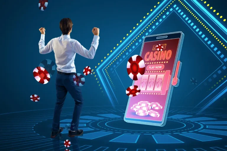
Your casino landing page is often the first thing a potential player sees when they discover your brand. If that page doesn’t grab attention and guide visitors toward signing up, you’re losing money. A well-designed casino landing page can be the difference between a visitor who bounces and one who becomes a paying customer.
The problem is that most casino landing pages leak users before they even have a chance to convert. Poor design choices, confusing messaging, or slow load times can send potential players straight to a competitor’s site. Understanding what makes a landing page work is the key to stopping these leaks and turning more traffic into real revenue.
This guide breaks down the essential elements that drive conversions on casino landing pages. It covers the design strategies that keep visitors engaged, the content that builds trust, and the optimization tactics that turn clicks into customers.
Key Elements of High-Converting Casino Landing Pages
A casino landing page needs specific components working together to turn visitors into players. The headline must grab attention immediately, the design should guide users naturally toward action, calls-to-action need to be clear and compelling, and the entire experience must work flawlessly on mobile devices.
Headline and Value Proposition
The headline sits at the top of the page and determines whether visitors stay or leave within seconds. It needs to communicate the main benefit in clear terms that speak directly to what players want.
A strong casino landing page headline focuses on specific offers rather than vague promises. For example, “Get 100 Free Spins on Your First Deposit” works better than “Amazing Casino Games Await.” The value proposition should answer the visitor’s immediate question: what’s in it for them?
The headline and supporting text should appear above the fold so visitors see them without scrolling. This area typically includes the main offer, a brief explanation of how it works, and trust signals like licensing information or security badges.
User-Centered Design Principles
The layout should guide visitors’ eyes naturally from the headline through key benefits to the signup form. Casino landing pages that convert use strategic placement of elements based on how people scan web pages.
Visual hierarchy matters significantly. The most important elements like bonuses and signup buttons need more visual weight through size, color, or positioning. White space around these elements helps them stand out and prevents the page from feeling cluttered.
Trust elements belong in visible spots throughout the page. These include licensing logos, payment method icons, security certifications, and customer testimonials. They reduce hesitation without disrupting the main conversion path.
Load speed affects both user experience and conversion rates. Images need optimization, and the page should load critical elements first so visitors can start reading immediately.
Strong Calls-to-Action
The call-to-action button represents the main conversion goal, whether that’s “Sign Up Now,” “Claim Your Bonus,” or “Start Playing.” This button needs to stand out visually through contrasting colors and sufficient size.
Button text should be action-oriented and specific. “Claim 100 Free Spins” converts better than generic text like “Submit” or “Click Here.” The language creates urgency while clearly stating what happens next.
Multiple CTAs can work on longer landing pages, but they should all lead to the same action. Placing one above the fold and another after key benefits gives visitors multiple opportunities to convert without creating confusion about what step to take.
Mobile Optimization
Mobile devices account for a majority of casino traffic, making mobile optimization essential rather than optional. The landing page must load quickly and display correctly on screens of all sizes.
Touch-friendly elements prevent frustration. Buttons need adequate spacing and size for fingers rather than mouse cursors. Forms should be simple with large input fields and minimal required information.
Mobile pages should prioritize the most critical information first. Visitors scroll differently on phones, so the headline, main offer, and primary CTA need to appear immediately. Less important details can sit further down the page where interested users will find them.
Conversion Strategies for Casino Landing Pages
Casino landing pages need specific tactics to turn visitors into players. The right personalization, trust signals, and clean design work together to remove barriers between interest and action.
Personalization Techniques
Personalized content matches what each visitor wants to see. Casino landing pages can show different game types based on where traffic comes from—slot players see slot promotions while poker enthusiasts see tournament offers.
Geographic personalization displays payment methods and currencies familiar to each region. A visitor from Canada sees options for Canadian dollars and local banking methods. Someone from Europe sees Euro amounts and relevant payment processors.
Dynamic headlines change based on the traffic source. Users clicking from a slots review article see headlines about slot bonuses. Those arriving from sports betting content see sports welcome offers. This alignment keeps messaging consistent from ad to landing page.
Time-based personalization adjusts offers throughout the day. Evening visitors might see live dealer games while daytime traffic sees mobile-friendly options. Birthday months can trigger special celebration bonuses for returning visitors.
Leveraging Trust Signals
Trust signals prove the casino operates legally and treats players fairly. Licensing badges from recognized authorities like Malta Gaming Authority or UK Gambling Commission belong above the fold where visitors see them immediately.
Security certificates show data protection measures are active. SSL certificates and encryption badges tell visitors their financial information stays protected. These symbols reduce anxiety about sharing payment details.
Key trust elements include:
- Valid gaming licenses with verification links
- Third-party testing certifications (eCOGRA, iTech Labs)
- Payment provider logos (Visa, Mastercard, PayPal)
- Responsible gambling organization partnerships
- Customer support availability indicators
Player testimonials with real names and photos add social proof. Win stories with verified amounts show others succeed on the platform. Review site ratings from trusted sources like Trustpilot provide external validation.
Minimizing Page Distractions
Clean layouts keep attention on the main conversion goal. Casino landing pages work best with one primary call-to-action button rather than multiple competing options. The signup button should use contrasting colors and appear multiple times as users scroll.
Unnecessary navigation menus create exit points. Landing pages remove top navigation bars that let visitors wander to other pages before converting. The path moves visitors toward registration, not exploration.
Distractions to eliminate:
- Pop-up windows that block content
- Auto-playing videos with sound
- Multiple simultaneous animations
- Excessive text blocks
- Social media feeds
White space separates sections and prevents overwhelming visitors with information. Short paragraphs with clear headings let people scan quickly. Forms request only essential information—username, email, and password rather than lengthy questionnaires that increase abandonment.
Optimizing Content for Casino Landing Pages
Content quality determines whether visitors stay or leave within seconds. The right words, promotions, and images work together to build trust and push users toward registration.
Writing Persuasive Copy
Landing page copy needs to connect with players immediately. The headline should state the main benefit in eight words or less. Visitors decide in three seconds whether to keep reading.
Short paragraphs work better than long blocks of text. Each sentence should lead naturally to the next one. Bullet points help players scan information quickly without getting overwhelmed.
The copy must address player concerns directly. New users want to know about safety, game selection, and payout speed. Statements like “Licensed and regulated” or “24/7 customer support” build confidence.
Strong action words create urgency without sounding pushy. Terms like “claim,” “unlock,” and “start” encourage clicks better than passive language. The copy should focus on what players gain, not just what the casino offers.
Trust signals belong near the call-to-action button. License numbers, security badges, and payment logos show legitimacy. Players need proof before they share personal information or deposit money.
Highlighting Bonuses and Promotions
Bonuses drive most casino registrations. The offer needs visibility above the fold where every visitor sees it. Players compare offers across multiple sites before choosing one.
Display the bonus amount in large, bold numbers. Break down complex terms into simple bullet points:
- Deposit amount required
- Wagering requirements
- Time limit to use bonus
- Eligible games
Transparency matters more than size. A smaller bonus with clear terms converts better than a huge offer with hidden conditions. Players distrust vague promises.
Multiple promotion types appeal to different player segments. Welcome bonuses attract new users while reload bonuses keep existing players active. Free spins work well for slot players. Table game players prefer deposit matches.
Countdown timers add urgency to limited-time offers. They push hesitant visitors to act now instead of returning later. The timer must be honest and match the actual promotion end date.
Utilizing Engaging Visuals
Images capture attention faster than text. High-quality photos of real games show players what they will experience. Blurry or generic stock photos damage credibility.
Visual hierarchy guides the eye to important elements. The main promotional offer should be the largest visual element. Secondary information can use smaller graphics or icons.
Colors trigger emotional responses. Gold and purple suggest luxury and high stakes. Green implies money and winning. Red creates urgency but can signal danger if overused. The color scheme should match the brand while standing out from competitors.
Game screenshots prove the platform works and looks modern. Players want to see the actual interface before signing up. Live dealer images add a human element that builds trust.
Videos increase engagement when kept under 30 seconds. Auto-play without sound works better than requiring a click. The video should show gameplay or winners celebrating, not executives talking.